Under Design
 Last week I attended the very excellent @media 2008 web design and development conference at the Southbank Centre here in London. There were some great presentations by Indi Young, Andy Clarke and others but I’d have to say Jeffrey Veen’s presentation was probably the most interesting for me, entitled Designing Our Way Through Data. Veen is an engaging and very funny speaker and he definitely knows his shit.
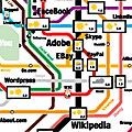
This was very timely as the topic of data visualisation, though by no means a new concept, seems to be pretty hot right now and has certainly piqued my interest. I’ve previously linked to a favourite project, On the map, by Stefanie Posavec where the artist has mapped out patterns and structures found in selected literary works.
A couple of great examples of innovative data visualisations from Veen’s presentation were:
- Digg Stack – a real-time interactive visualisation of what is currently getting Dugg.
- Newsmap – a map of what’s in the news as listed in Google’s news aggregator. Nicely illustrates patterns and bias in the world’s news media.
- Gapminder World – an animated graph of world progress using various indicators such as income per person, GDP per capita, CO2 emissions, etc.
Elsewhere, Viget Inspire has written about interactive data visualisation and social networking, Smashing Magazine featured a big data visualisation round-up and Coolinfographics is an entire blog dedicated to the subject.
2 comments
10:42 pm
Have you been following the processing.js sheebang from John Resig? (http://ejohn.org/blog/processingjs/)… I reckon there will be heaps of cool visualisation stuff come out of that one – go the canvas tag!
1:17 pm
Wow cool. No I hadn’t seen that but I’m definitely looking forward to a new generation of animated mouse pointers and trails!